White Paper Design for Calm
I had the pleasure of collaborating with Calm on an insightful research project aimed at exploring mental health benefits at the workplace. My role was to design a comprehensive white paper that visually communicated the research findings in alignment with Calm’s established brand guidelines. By adhering to their brand's aesthetic and voice, I ensured the white paper was not only informative but also seamlessly integrated with Calm’s visual identity, reinforcing their commitment to clarity and calmness. The final design effectively highlighted key data and insights, offering a professional yet approachable presentation that resonates with Calm’s audience.
Virtual Presentations for Taco Bell
During the COVID-19 pandemic in 2020, I designed a series of presentation decks for Saratoga Food Specialties, aimed at enhancing their partnership with Taco Bell. As Saratoga pivoted to virtual presentations, I developed a series of bi-weekly presentations focusing on educating Taco Bell's R&D department about flavor profiles and introducing innovative menu item ideas. Embracing Taco Bell's brand ethos of innovation and disruption, the presentations were crafted to be fun, engaging, and eccentric. In addition to designing the decks, I played a key role in facilitating the presentations, ensuring a smooth and interactive experience. The positive feedback we received underscored the presentations' success in strengthening our collaboration and demonstrating Saratoga’s dedication to creativity and excellence.


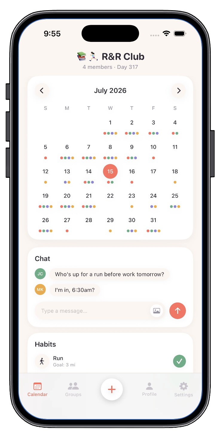
Zingtree White Paper Design
I designed this 12-page research white paper for Zingtree in partnership with CMSWire, transforming survey findings from more than 1,000 U.S. consumers into an engaging and easy-to-digest visual story about AI and complex customer support.
My goal was to make a data-heavy report feel approachable while staying true to Zingtree’s visual identity. I established a consistent layout system and used typography, color, photography, infographics, and data visualization to create hierarchy and guide readers through the research. Key statistics were pulled forward as visual moments, while charts simplified more detailed findings so readers could quickly understand the main takeaways.
The final design balances brand storytelling with information design, turning complex research into a polished marketing asset that could communicate Zingtree’s expertise in AI-powered customer experience.

Website Redesign for Saratoga Food Specialties
I spearheaded the website redesign for Saratoga Food Specialties, a sub-brand of Smithfield Foods, leading the creative direction from concept through execution. The project was driven by feedback from the sales team, who felt the existing website was outdated and difficult to navigate. My goal was to create a modern, visually engaging experience that improved usability while better showcasing the brand's products and services. In addition to designing the UI and UX, I developed the creative concepts for the website photography and personally photographed the imagery, ensuring a cohesive visual style throughout. The final redesign combined thoughtful user experience with a refreshed visual identity and received enthusiastic feedback from both the sales team and CEO, who praised its updated look and improved functionality.


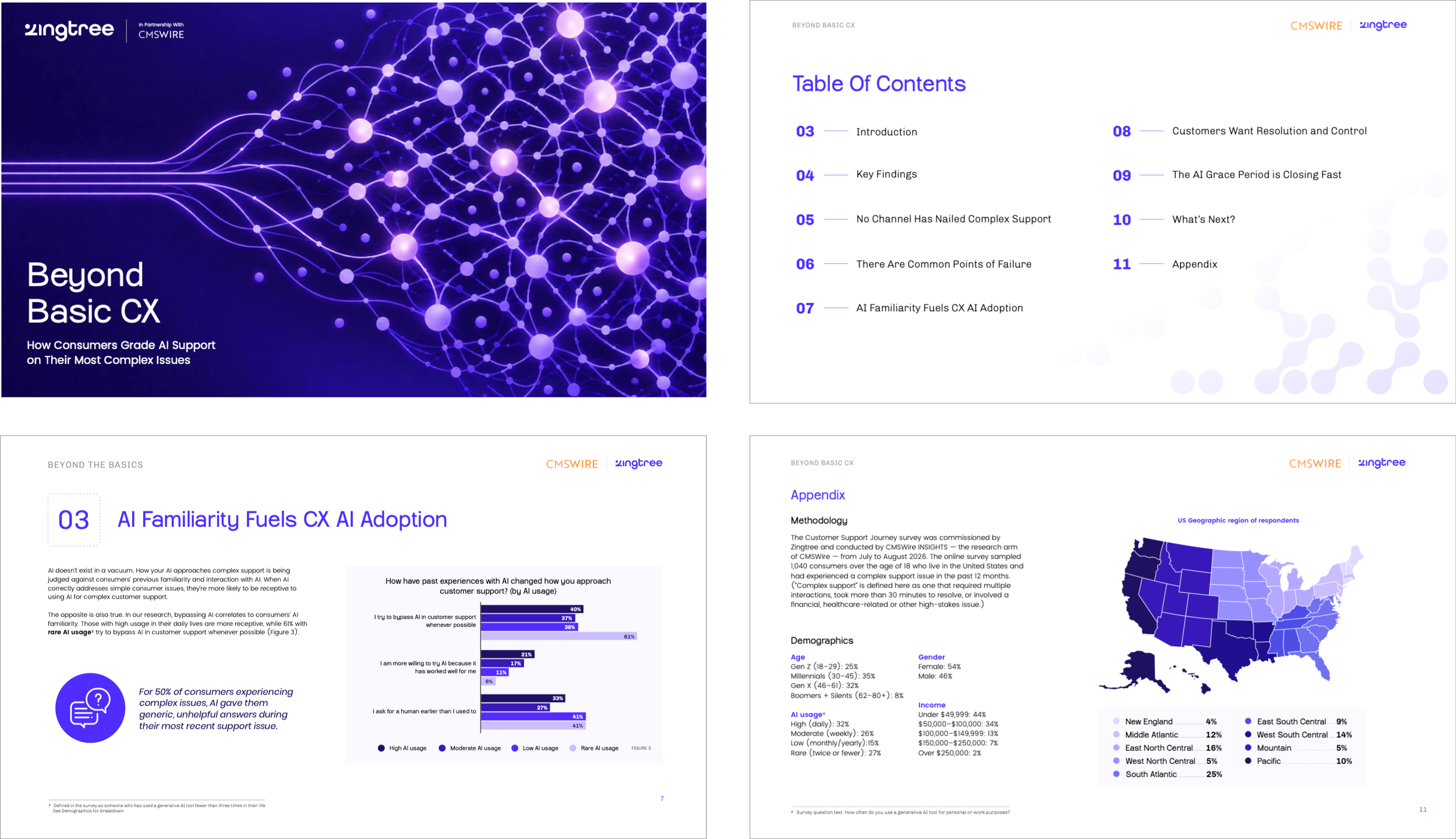
Simpler Media Group — Media Kit
I designed this 32-page media kit as a key sales tool for Simpler Media Group, helping the team clearly communicate the company’s audiences, advertising opportunities, research services, and marketing solutions to prospective clients. The challenge was organizing a large amount of information into a presentation that felt polished, engaging, and easy to navigate.
I created a flexible visual system that brings together SMG’s three publications—CMSWire, Reworked, and VKTR, while still giving each brand its own identity. I used strong typography, photography, color, data visualization, and custom graphics to simplify audience demographics and product offerings, giving the sales team a cohesive resource they could use to tell SMG’s story and guide client conversations.
Packaging Design for Toy AR Blaster Gun
I was tasked with creating packaging for BIT’s (Bean Technologies) new Toy Augmented Reality Blaster Gun, I focused on delivering a design that was clean, technical, and exciting, with a distinct TRON-inspired vibe per the client’s request. The goal was to captivate their target audience while providing a clear understanding of the product’s role within their game. By integrating sleek, futuristic visuals and dynamic elements, I crafted packaging that not only stands out on the shelf but also visually communicates the immersive gaming experience the AR Blaster offers. The result is a striking and engaging package that effectively appeals to consumers and enhances their anticipation of the product.


Product Catalog Design for Pack Plus Converting Inc.
I undertook the task of redesigning Pack Plus Converting Inc.’s product catalog to meet their needs for concise, easily accessible product specifications with a clean, modern aesthetic. By paying meticulous attention to detail, I ensured that all product information was accurate and presented in a straightforward manner. The new catalog provides a refreshing upgrade from the previous design, offering a streamlined and visually appealing layout that enhances readability and effectively communicates key product details. The result is a catalog that not only meets Pack Plus Converting Inc.’s functional requirements but also elevates their brand presentation.
Marketing for Awards Program
I led the creative direction for the 2027 IMPACT Awards marketing campaign by designing a flexible, multi-brand advertising system for CMSWire, Reworked, and VKTR. I established a unified visual language built around bold editorial typography, a signature "A" graphic motif, dynamic layouts, and human-centered photography that could be adapted across each publication through distinct brand colors and messaging. The project included designing a library of reusable banner templates in multiple standard advertising and social media dimensions, optimizing layouts for different aspect ratios, and creating a scalable design system that streamlined campaign production while maintaining a premium, recognizable brand experience across every touchpoint.


Branding for Corellia Finance & Tax
I had the exciting challenge of creating a brand identity inspired by the Founder’s passion for Star Wars. The company, named after Corellia, a renowned planet in the Star Wars galaxy celebrated for its ace pilots and grand starships, the branding needed to reflect this adventurous spirit. I incorporated the iconic yellow Corellian Bloodstripes, symbolizing courage and integrity, into the design. The logo features a Star Wars-inspired font, blending seamlessly with a minimal and clean aesthetic. This approach not only honors the Founder’s fandom but also establishes a professional and distinctive brand presence.
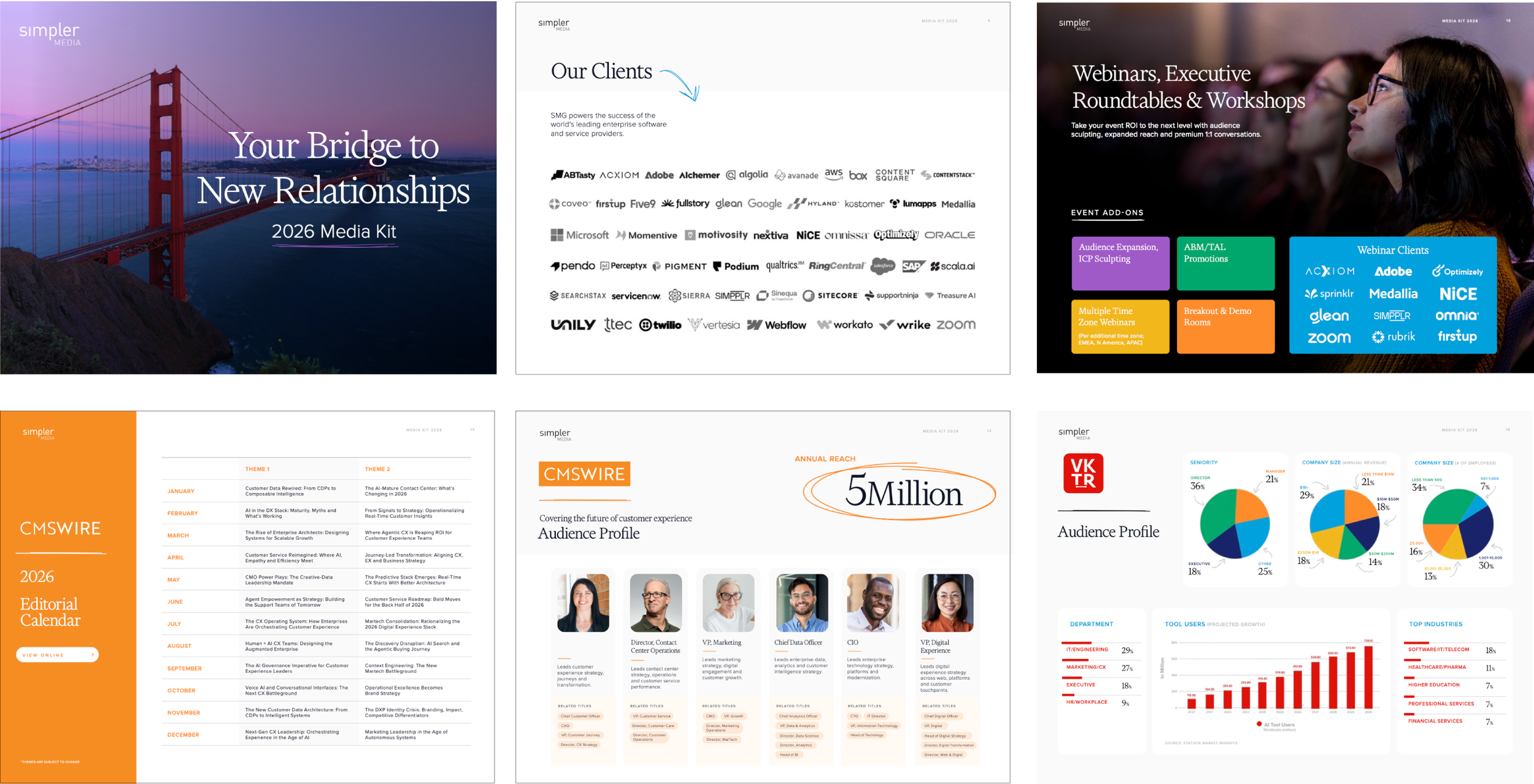
Research Report Design
I was responsible for designing a visually engaging and user-friendly document that explores how sophisticated marketing technology stacks and AI advancements are transforming content management and customer experiences. The reports examine current customer experience challenges, underscored the importance of technology investments, and illustrated how generative AI is driving business value. I created easy-to-read charts to clearly present the company's original research, ensuring the data was both accessible and impactful. The overall designs are clean and adhere to the brand’s visual standards, providing a coherent and professional presentation of key insights and trends.

Calming Strategies Poster for Toddlers
As a mother of a 5-year-old navigating big feelings, I developed a "Calming Strategies" poster aimed at aiding toddlers in self-regulation. Leveraging insights from child psychologists, I designed the poster with thoughtfully crafted, toddler-friendly illustrations that clearly depict various calming techniques. Each illustration was created with attention to the developmental needs of young children, ensuring that the visual representations are both engaging and easily understandable. The poster includes visual cues for strategies such as deep breathing and taking breaks, which have proven effective for my own child. By selecting and pointing to the strategies he wishes to use, he is able to manage his emotions more effectively. This highlights the poster’s success in facilitating emotional regulation and providing practical support for young children.

GIF for Local Bakery’s Social Media Accounts
I created a cheerful GIF to announce Simple Irresistible Dessert's’ new line of cupcakes. The animation features a detailed illustration of a cupcake with a lively and engaging animation. The simple yet effective design highlights cupcakes and featured playful details, capturing attention and conveying the bakery's enthusiasm for their new offerings. This GIF was crafted to resonate with the audience, driving interest and excitement about the bakery’s latest products.
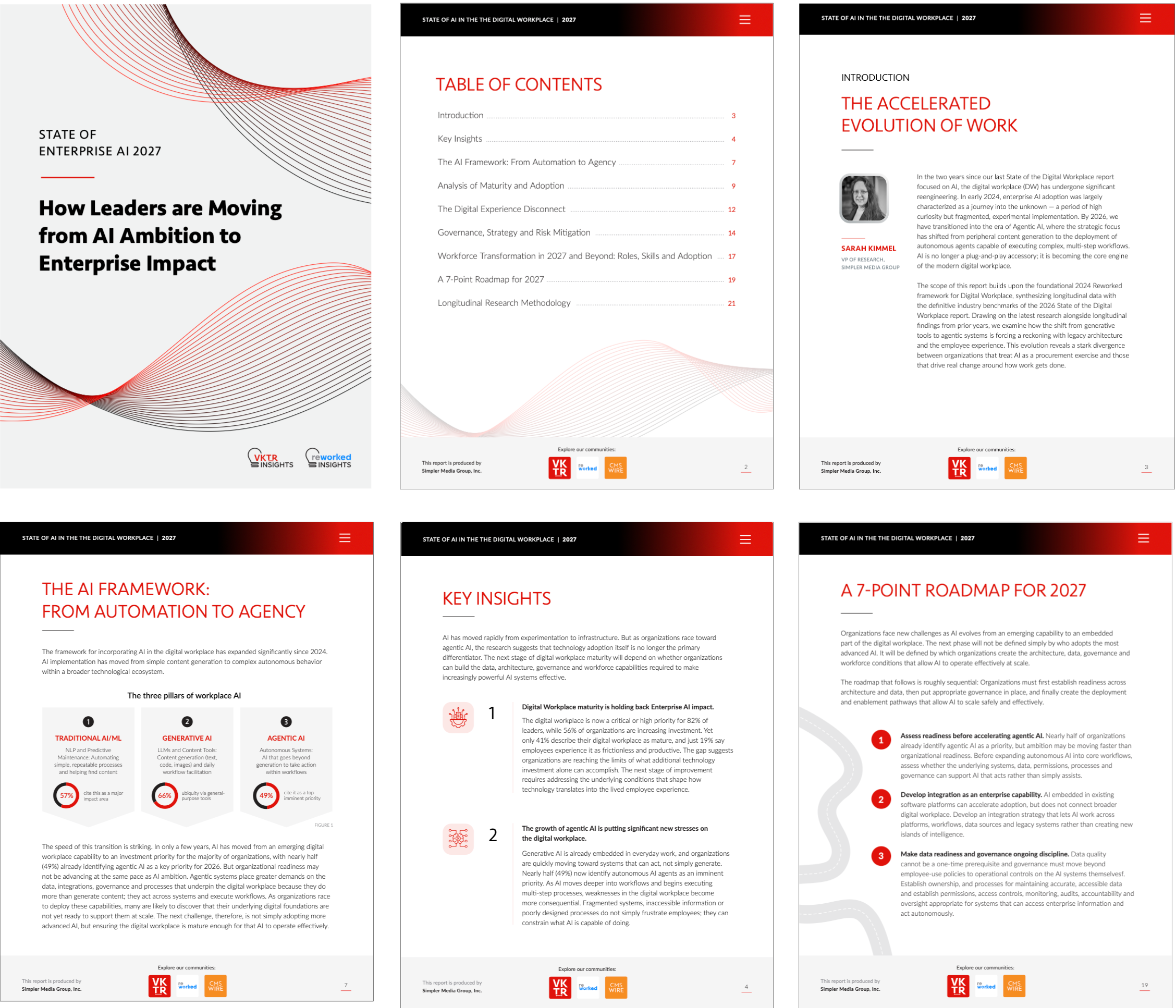
Togetherly Mobile App
Togetherly started as a self-initiated project after I noticed a gap in the habit-tracking space. Many accountability apps I came across felt visually uninspiring or unintuitive. All the apps I came across focused on individual progress rather than giving people a meaningful way to build habits alongside friends, partners, or small groups. I wanted to explore what a more visually engaging and social approach to accountability could look like, one centered around shared progress, encouragement, and consistency rather than competition.
The project also became an opportunity to push myself beyond my traditional design skill set. I taught myself how to vibe code and use AI-assisted development to take the idea from concept and visual direction to a functional prototype. Togetherly is still a work in progress, but it’s a project I’m especially proud of because it reflects how I like to work: identifying a problem, taking initiative, learning new tools, and being resourceful enough to bring an idea to life.